In 1866 Fyodor Dostoyevsky published “Crime and Punishment”. Towards the end of the book, his hero, Rodion Romanovich Raskolnikov, has a feverish dream. This strangely prophetic text, quoted and used as the narrative line in this book, is from Richard Pevear and Larissa Volokhonsky’s 1992 translation, published by Vintage Classics. Here is the brief text:
“He had dreamed that the whole world was doomed to fall victim to some terrible, as yet unknown and unseen pestilence spreading to Europe from the depths of Asia. Everyone was to perish, except for certain, very few, chosen ones. Some new trichinae had appeared, microscopic creatures that lodged themselves in men’s bodies. But these creatures were spirits, endowed with reason and will. Those who received them into themselves immediately became possessed and mad. But never, never had people considered themselves so intelligent and unshakeable in the truth as did these infected ones. Never had they thought their judgments, their scientific conclusions, their moral convictions and beliefs more unshakeable. Entire settlements, entire cities and nations would be infected and go mad. Everyone became anxious, and no one understood anyone else; each thought the truth was contained in himself alone, and suffered looking at others, beat his breast, wept, and wrung his hands. They did not know whom or how to judge, could not agree on what to regard as evil, what as good. They did not know whom to accuse, whom to vindicate.”
During the early days of the pandemic, the news media and print and online media, started producing illustrations of what a coronavirus looked like. This came from an understandable public thirst for information about how this deadly virus and how it worked. Many of the images produced were stunning: surprisingly lush and jewel-like. The colors used were often saturated and seductive. But of course, those beautiful colors and that beautiful subject matter, the virus itself, has already killed almost half a million people here in the US and millions around the world.

At the same time that I was collecting all of the images on the internet, (more than 120 edited down to 36,) columnists and essayists started publishing references to previous historic pandemics that humanity had survived. We looked to these stories of the past for solace and hope. Many had not heard about even the most recent global epidemic, that of the great influenza pandemic of 1918-1919 that had killed many of our grandparents or great-grandparents including the grandfather of the 45th president of the USA. We read these articles and books to create context for the current spread of COVID-19. There were many examples cited of the numerous plagues of medieval times like the bubonic plague also known as the Black Death, which killed half of Europe. But the historical record went back much further, with classical references to the Great Plague in Athens in 430 BCE and the Justinian Plague of 542 CE. Newer books like Albert Camus’ The Plague, and recent movies like Contagion and Outbreak scared us and were objects of fascination.
But the text cited above, one small paragraph from perhaps the most famous of Dostoyevsky’s novels, struck me as the most startling if for no other reason than its prescience. As I was looking for a text to use for the visual book I had started working on, this one seemed the most powerful and apropos.
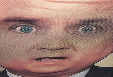
The manipulated images I used were collected from the web during the first four months of the pandemic. As I mentioned above, they were originally made as small web illustrations to show the public what the coronavirus looked like. The original illustrations were then significantly manipulated and changed in color, and by being converted to large half-tone patterns. This was done by separating the four CMYK layers into discreet channels, converting each file into different dither or halftone patterns, and then reassembled them back into a new file with the four process colors.
The narrative text is driven by Raskolnikov’s delirium, his fever dream. I wanted the large full-bleed images to be the theatrical visual accompaniment to that short text: hallucinogenic and furiously color saturated, and using the highly lurid language of a feverish nightmare.
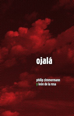
I have long made use of manipulated CMYK images using various swapped separation colors and different halftone patterns. Indeed my 1979-1980 MFA Thesis work at Visual Studies Workshop was in two parts, a written text book that I edited called Options for Color Separation (VSW Press), and a large portfolio series of screen-printed portraits called Portrait Constructions, that used large half-tone and other patterns. Later I made several other artists' books that used enlarged and/or swapped multi-channel process color methods. This included Civil Defense (1982), High Tension (1993), Long Story Short 1997), Paradise Lost (2013), and Ojalá (2015).
My obsession with patterns and half-tone dots comes from way back. I learned traditional photographic printing darkroom and photo-mechanical work in grad school in the seventies doing my own artwork and then working for the Visual Studies Workshop Press. I served as Chip Benson’s assistant when he did a two-week offset darkroom workshop at VSW. I then trained as an optical color-separator in 1979-1980 with Harry Christen of Christen Lithographic Lab in Rochester. Then I worked as the darkroom camera operator at Open Studio, an artists’ press where we did work for Aperture, most of the galleries in New York and Boston, and Howard Greenberg Gallery in Woodstock, doing 300 line duotones and tritones. And I had my own business for eight years after that doing all sorts of pre-press and design work.

Delirium is printed in 2020 by archival pigmented inkjet onto Mohawk acid-free paper, 60 pages, in an edition of 30, handbound by the artist, and signed and numbered. The book comes in an archival, protective, phase box. The dimensions are 37cm x 28.5cm x 1.5cm (14.5" x 11.25" x 5/8").
The font used for the text is Northwoods, by Cultivated Mind Foundry in Vancouver, BC, Canada. It was picked because of the way that it looks both like type used in a late 19th century schoolbook primer, yet still appears quite modern. Like many of their digital fonts, it was originally created with the careful strokes of a sign-painter’s paintbrush.
The book is not inexpensive, but it uses over $225 dollars in just archival pigmented ink and archival papers and book cloth for each volume. In addition, each book requires approximately two days of labor to print, handbind and finish.
ISBN: 978-1-63649-669-6 ; $650.
© 2020 Philip Zimmermann.


