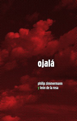
I had the idea for the book, and did some little sketches for it, during my sabbatical in 2003-2004. I was in a year-long residency at the Border Art Residency in La Union, New Mexico. I was taking a lot of photos of the incredible skies in New Mexico and Arizona while there, and they made their way into a lot of the work that I made during my year there. Living right on the border I was also very aware of the crossing of illegal Mexican immigrants, as described in a previous post, especially in a section of the Sonoran desert neat Why and Ajo Arizona which I visited several times.
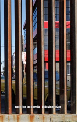
I almost got my camera confiscated taking photos of several busloads of apprehended undocumented Mexican workers being bussed across the border back to Mexico in Agua Prieta. The disparity between the unhappy apprehended Mexicans and the reality of the fact that so many workers in Southern New Mexico and Arizona are undocumented seemed glaring, almost all of the really unpleasant jobs were filled by them.
During the summer of 2006 I did a one month residency at Light Work at Syracuse University in New York State, and while there I completed two books that I had started work on earlier, Shelter and a finished inkjet version of Sanctus Sonorensis. Like some other books I have done, I planned on having two different editions, one inkjet and the other either offset or HP Indigo. After I printed about 5 or 6 copies of Sanctus on my Epson printer I realized that it was not a feasible way of producing the work. Each book took almost $50 of inkjet ink and an equal amount for paper and had the familiar inkjet problem of very fragile, easily scuffed, pages.
I decided to concentrate on raising the money to have it printed offset, which is in any case my preferred printing medium. I had brought up the idea to Light Work since they occasionally will print a monograph of one of the artists’ that do a residency there. However it was a bit too large a book project for them to take on. After my move out here to teach at the University of Arizona in 2008, I tried getting a couple of grants to help with production costs, including one from the Arizona Council on the Arts. Unlike New York’s NYFA though, I found out that they do not give money to help with publication printing costs, not realizing that for artists’ book makers, this is like getting money for paints or film or whatever.
I decided to fund the project myself, though it is a real financial stretch. I knew that I wanted it to be a board book, a form that has no conventional sewn gutter since the spreads are printed as one sheet, using the paper as the folding hinge. This is terrific for images that cross the pages like the skyscapes I used. The sales rep, Frances Harkness, at CandC Offset Printing in New York (an “off-shore” Chinese printing company with a branch in NYC) had been a student of mine many years ago at Purchase College, SUNY. She knows artists books and also that I like to push the physical structures of the book form, (as do many other artists’ book makers) and she helped with some suggestions as far as production. C&C is probably one of the most experienced board-book printers in the world, a funny niche production area for printing. They printed over 140,000 copies of Art Spiegelman's In the Shadow of No Towers, another large board-book.
I decided to really try to emphasize the missal-breviary-beatitude idea by making it look like a sort of very high tech version of those Catholic book forms. I added gilded edges, the rounded corners and the gold-foil stamped titles to have a visual association with religious books like breviaries or missals. The text is meant to be read out loud as if by priest or an acolyte standing in front of a congregation (and maybe even repeated back by their flock), and I wanted the book to have the right kind of look (or bling) for that task. This was a big improvement I think over the inkjet version that I had completed in 2006. I grew up in a very Catholic family and although I personally rejected Catholicism in my early teens, it is, alas, deeply burnt into my psyche.
I have always liked repeated –or almost chanted– texts. I used a similar device in High Tension, and admired it whenever I saw it used by writers that I admired like Vladimir Nabokov and others. It seemed perfect for this book since I did feel it was a sort of meditation. There is a long history of repetitive chants in prayer and meditative tracts, from Buddhist mantras, to Christianity to Hinduism and on and on through many if not most spiritual practices.
In an email exchange CJ Mace brings up an important idea for me: “ritualized language can be an effort to make slow change through repetition. It can be both an effort to change and a way to deal with the fact that change may not come.” I also find that the practice of making artists’ books, for me, is one that takes place best over long periods of time with little adjustments and repeated small changes in all aspects of the work, including the text and the images. I think this is why most of my best books have a very long evolution where they percolate and simmer over time. (I think I am not a very prolific or fast book maker for that reason).